
BRANDING
Branding starts at the story. With every client branding is catered to the clients story whether it’s the company story or the client story either on the surface or as a deeper dig. Additionally the branding aesthetic caters to the clients style and vision with my execution. It’s important that I highlight the client so they truly feel their branding embodies them. All branding comes with a branding guide unless otherwise requested, 4 stages of branding iterations that includes color options and every file type needed in the future.
-
Inital concepts are almost always provided through hand-rendered sketches. Options are whittled down to a small selection from the original exploration.
-
Half of the initial options are then digitized additionally alternate options riffing off of the chosen selection are provided.
-
Final Branding is provided with any changes or iterations both client and I land on. This includes alternate typeface options and or minor tweaks.
-
The final round of branding is a color exploration. It provides colors the client requests; with additional options I personally recommend based on the clients identity.
-
Final Branding guide and all files needed for the future are provided as final deliverables. Additionally any out of the general scope of needed files can be made and added in, such as embroidery files and or knit-in BMP files for branding.
BARNES AND MORGAN
A custom visionary coverall apparel line rooted in tradition and Muslim faith. The name itself derives from the owners parents last names and the center icon a contemporary spin of the “and” mark in arabic. The mark itself mimics weight and line quality in both mark and typography. I played with mostly type and some apparel icons such as seen with the needle. Barnes and Morgan prides itself on tailoring and made to fit qualities, so keeping the mark to primarily a clean typography heavy icon was the goal. Additionally the mark ended up being a great vehicle for a repeat pattern that could be used on packaging and the long thin aesthetic ended up being perfect for back of neck coat hanger style labels.
CONCEPT EXPLORATION EXAMPLES:
WUNDERBE
A children’s apparel and art subscription box kit centered around design. It’s all about the fun, the quirkyness and the art supplies available. Wunderbe’s logo uses a squirt of paint but can easily be simplified with the removal of the paint utilizing the custom workable “wunderbe” typeface. Below you can see a few of the iterations of options I played around with, because the brand is so playful I went down to paths, classic clean and illustrative playful. Additionally because the products are either used or worn by kids it was important for me to explore art supplies and hands in the logo mark; some of which can be seen below.

CONCEPT EXPLORATION EXAMPLES:

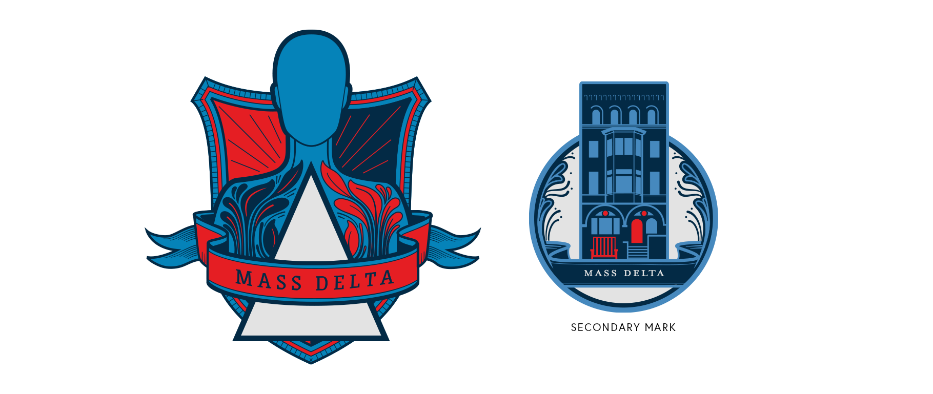
MASS DELTA
Mass Delta’s branding highlights the rebirth of the fraternity as the first non-gender specific fraternity in the United States. Both the primary logo and the secondary graphic mark play with the creative quirkiness the fraternity truly embodies; this can be seen in the non-gender specific icon and the building “face” highlighting the iconic MIT red chair. Some of the options I provided in my initial exploration were the red chair that has become an icon in the community, the genderless manaquine something the group currently has in their house and more taditional icons. The triangle, sword, filagree, and wreath are all ode’s to the original MIT logo. Finding a good balance between new school “artistic quirky vibe” while still respecting the tradition of MIT was really fun.
CONCEPT EXPLORATION EXAMPLES:


PAPAMONTY
PAPAMONTY is a tattoo style inspired brand, selling apparel, bags, socks and print products. The logo is made of a custom “PAPAMONTY” typeface a riff off of old english. With so much of the brand being on apparel product, it was important to keep the branding clean to execute on a range of sized items; ex: labels. Generally when I work on branding it’s really important to know where the brand will be used or the potential of what the brand could be in the future so the logo is designed with that in mind. PAPAMONTY is also founded of of the owners parents so it was really important to keep it type based rather than with an icon. However in the past year an icon was added of the families first dog Sunny.

LENAS KITCHEN
Lena’s Kitchen is a food blog delivering recipes, food styling, and how to’s. Lena’s brand is saturated in clean contemporary aesthetic and pastel palette. Lena is not only known for her aesthetic but her charcruterie boards and Russian heritage seen in some of her contemporary takes on traditional Russian dishes. It was important for me to explore charcruterie icons and additionally include her heritage in a subtle way. The final logo played with a nesting doll concept but with bowls, Lena’s color palette and a clean typeface that mimicked the line weight of the bowl line.
CONCEPT EXPLORATION EXAMPLES:

KNOWN ASSOCIATES SOCIAL CLUB
Known Associates Social Club is a creative hub to locals and visitors. The space itself is comprised of a live music lounge, a private chef’s dinner space, restaurant, bar and lounge, and art gallery. The space was designed to invite locals and visitors in the creative industry to come together in one space. The initIal inspiration behind the space was John Wick’s Hotel for assassins. With that being at the top of mind the design for the logo was creating an emblem that could be known by creatives as a guiding star. Much like the film the coin, in this case the logo would be a beacon throughout the community and eventually in different communities throughout the world that would be a symbol of a secret social club known to creatives. The space is located in an underground basement space, with the only signage the star itself from the logo. I tried various concepts but ultimately landed on two concepts the “northern star” and the “bee”. The northern star is a guiding light for creatives, and the bee representing the bee hive mentality a place where like minded people could come together to collab and vibe off of each other.

CONCEPT EXPLORATION EXAMPLES:

PHOZOLE
Rooted in the owners Mexican and Vietnamese heritage, Phozole is a fusion based to-go soup popup. The owners are so fun and with the ease of their fusion it was important to keep the logo fun with a hint of street food vibes. I really loved the opportunity to do a style that was inline with my personal style and love of noodle art. The final logo played with movement and looks like a sticker you’d be able to slap on the back of a stop sign which ultimately fit the aesthetic to a T.

CONCEPT EXPLORATION EXAMPLES:

ALKEMIC COLOR
Alkemic Color is a Portland based video color grading company. The company was really drawn to alchemy and the process of change. With a focus on merging color and sound to maximize the story telling in each video Alkemic color alters it was important for me to find a way to show the alkemic property the company is drawn to. Additionally to show the range of color the process can alter in respect to the film they work on daily it was important to incorporate the film and color aspect.

CONCEPT EXPLORATION EXAMPLES:

POWERHOUSE DESIGN
Powerhouse design is a Portland based 3D Rendering and housing consultant agency. Focusing on the clean aesthetic of Julian the owner and founder of Powerhouse design I focused on finding a clean solution to words that made up the companies name. Below you can see a few options of the designs in the iniital hand rendered options; I focused on an electrcal outlet, power button, home, and home like shapes. We ended up landing on a clean type heavy icon, with the O in the shape of a electrical plug in and a house.

CONCEPT EXPLORATION EXAMPLES:

THE PIGGY
The piggy is an adulting zine focused on keeping the readers money at the forefront of daily living. It was important to keep the logo casual and playful; especially since the zine is geared towards young adults’. Additionally the logo would be sitting on colorful pages and infographic layouts so it was important to keep it black as it would be visible no matter the background. .

CONCEPT EXPLORATION EXAMPLES:

AGUABAEBEE
Aguabaebee is a spiritual community based website centered around a variety of esoteric themes that run through the community itself. From Yoga to Tarot cards; Aguabaebee is a new age take on traditional themes. With that said the logo itself is quite simple; the founder did not want any particular bells or whistles just a circular addition to a new age classic typeface to represent the never ending lessons and practice seen in many of the traditions. The secondary mark was made particularly thick to hold various colors or designs so subscribers could eventually rely on the circle as a design key.

BURGER DIVAS
A burger blog located in Charlotte, NC enticing readers to get involved in all things burger around her city. It was important for the burger diva herself to be seen in the logo and/ or represented in it. The logo is a riff of the original founders logo as she came with the intent of revising but not completely loosing the flavor or the original brand. Dianna the burger diva loved many of the designs so there wasn’t one particular logo she went with and the icons were given in a format to be used interchangeably.
CONCEPT EXPLORATION EXAMPLES:

NIC WHITE
Nic White a Portland based photographer with expertise in family and baby photography. Nicole wanted to incorporate the whimsical nature of her work in her logo and additionally create an aperature icon that could be used as a watermark on her photos. The final logo is a hand scripted version of Nicole’s photography handle in a whimsical colored typeface; in addition her aperature reflects the same line quality and color.
